![]()
|
|
| Mistake at the Transit Museum (1523492) | |||
|
|
|||
| Home > SubChat | |||
|
[ Read Responses | Post a New Response | Return to the Index ] |
|
||
Mistake at the Transit Museum |
|
|
Posted by gbs on Tue Sep 10 16:32:36 2019 The museum at Grand Central has a great display of old subway and other transit signage, showing the changes in styles, materials, and information over the years. There's the famous "Know Your Routes" sign from the mid-'60s when the BMT introduced letters, and a display of mosaic letters from A to Z, and lots of other interesting stuff. One panel even shows the differences between Helvetica and Standard. (I personally love the Q and 2 in the Standard font. They surface occasionally on some current posters.) Two photos have been mounted next to the wrong descriptions and need to be switched. I alerted a staff member and she said she'd tell the director. What are the chances it will get corrected, or that anyone else will notice? I'm purposely not identifying the two photos in case any other sleuths here want to check it out for themselves. Standard Q: 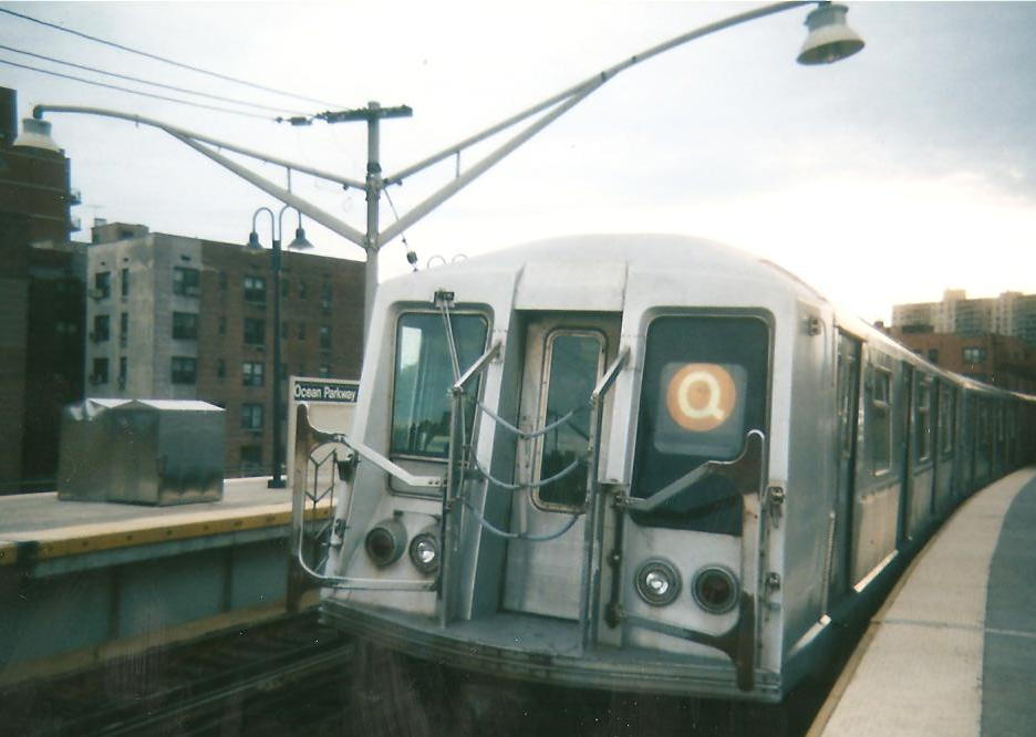 Helvetica Q: 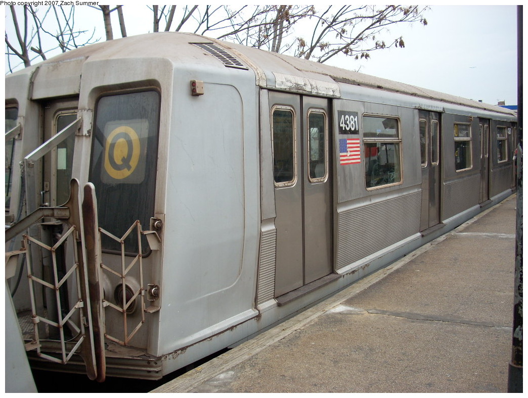
|